Travelperk
2019 - Ongoing
At Travelperk I’m focusing on native mobile apps.
I’m going to share with you some highlights that I and a great team of developers at Travelperk have been working on this past year.
My role
I lead the design of the very first Travelperk native apps (iOS, Android)brand new app from scratch to help travelers make their journey with the minimum friction possible. My main responsibilities are delivering features for iOS and Android platforms and building a completely new design system that can work across both platforms.
Platforms
Android
iOS
What I do
- Lead the product design & vison
- Build product concepts
- Lead the visual design for the entire iOS & Android
- Design System for mobile apps
- User research
- Advocates other designers to mobile
- Establishing and documenting patterns and best practices
The Team
Engineers: iOS, Android
Product design: Marco Da Silva
Research: Marco Da Silva + Research team
Product Manager: Damir
Content writer: Jess
TravelPerk App
Over the last 2 years I been working on the native mobile (iOS and Android apps for TravelPerk.
The TravelPerk app serves as a companion app for travelers. It currently aims to cover the most important functionality for travelers. Trips, Booking & Itinerary management – All flight, hotel train & rental car information in one place. A traveler does not have to fiddle around with a bunch of emails.
Last year I been more focus on native booking flows by evolving from a companion app to the day-to-day traveler product
The challenge
Being a new app, this involved a large cross-functional team from business relationships, product roadmaps and backend teams, to product design and app development on iOS and Android.
Redesigning Business Travel
Provide travelers on the go with the services & information they need, at the right place and at the right time.
Maximize the impact brought through our native experience. To reach 1 million happy travelers per day, we believe that a delightful & deeply integrated app can provide a far more superior experience than any browser-bound platform can offer.
Create a new design language
Create a new visual language that highlights a more mature app tailored for business travelers.
I wanted to create a visual language that felt familiar, regardless of what the user is booking. So regardless of what the user was exploring, whether flight, hotel, train or rental car options, the experience was quite the same, the same interactions have been built for all of them.
How might we...
give travelers a delightful & reliable app that fits their needs when planning & traveling.
The craft
Selected
work
Important parts of the app that I’ve helped to build
Design System
I build and define the foundations for Travelperk future through the development of the app design system.
This involved both development and iteration of the visual style, as well as considering how we work with the system itself, between the native app and web. Looking closer at micro-interactions to improve usability, I led the initiative to make our native apps more inclusive and accessible.
One of my goals was to create a consistent experience through the whole app. I wanted to create a visual language which felt familiar, regardless of what the user is booking. I built a technical design practice based on close collaboration between the design and engineering team.
Booking
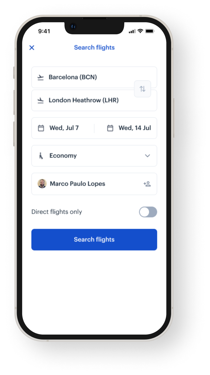
This feature was one of the last ones I build from scratch, the idea is not copy from what we had on web platform but challenge ourselves to build a tailored experience for our mobile users. This involved a large cross-functional team from business relationships, product roadmaps and backend teams, to product design and app development on iOS and Android.
Giving users a good experience when booking services from the app will enable them to handle their trips from beginning to end on mobile. Therefore we can fully retain users on mobile and grow the adoption.
Trips
This experience was the first one we have work on, showcase to the use all the trips that are upcoming on following days, weeks.
Given the mobile focus, we heavily want to focus on the currently ongoing or shortly upcoming.
Itinerary
The goal of our itinerary is to give travelers a chronological breakdown of their trip. It should not only display the services but also the context around them.
A service can be a flight, hotel, train, car rental, or a generic entity. A service is a type of information that is bound to the trip or service.
Service detail page
Flights, Cars, Hotels, Trains
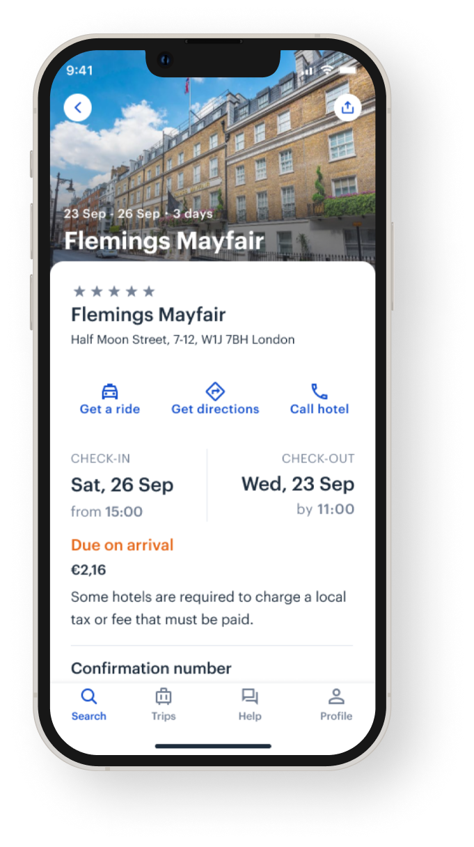
The service detail views give a comprehensive full-screen overview of all information and actions related to that service. A user should be able to find all information and actions that can be done with that service on this screen.
I worked on all 4 vertical designs, showing all the information the user needs on the go.
Help Assistant
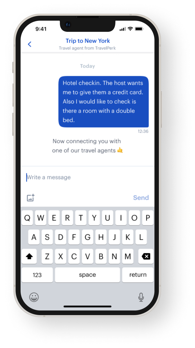
Native chat, upload files, score the assistant
We want the mobile app to become the central point of contact for travelers with agents after a trip has been booked. The mobile context and the native capabilities such as push notifications give us the ability resolve issues much quicker. We want to set the foundation
Other features
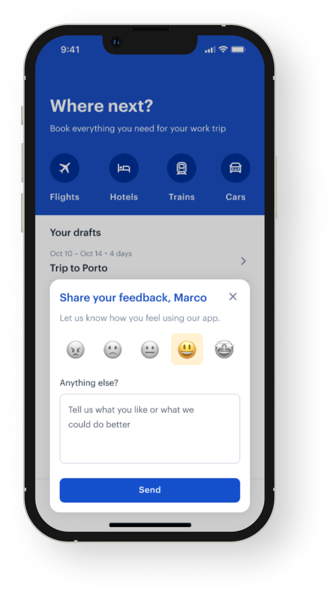
Splash screen, Sign in, Onboarding, Feedback, Profile
Apart from all above, I have also worked on small features also on authentication and so on…
International localisation
I was responsible for optimizing our native interfaces to work equally well in Spanish, German, and English.
Learnings and takeaways
Every new project delivers a wealth of knowledge and learnings that help me grow as a professional.
The travelperk app presented us with an opportunity to explore the world of business travel in a way that challenged us to think about how we can better build an itinerary that is useful on the go for our travelers.
I believe that in order to impact the customers and business travel, we need to champion new and innovative technologies to create meaningful experiences that solve real user problems.
Although the process to reach our ideal solution was not an easy one as the design is never finished is always involved – from a small team, cross squad challenges, and also the struggle of managing never-ending scope creep – our experience led us to build new friendships and grow as professionals, all while having fun.
- Take a holistic approach first to build a scalable foundation before transferring full ownership to the verticals.
- Divide and conquer problems to ship real value to users instead of tackling monoliths forever.
- You can’t build anything by working in silos. It’s a cross-vertical problem.
Research is and should be flexible
What we think might lead us to the answers we seek may not be the best approach once we dive in.
Synthesize insights together
Multiple perspectives from different backgrounds and skillsets can lead to richer insights.
Collaboration mitigates personal bias from imposing on the research, while also helping the team stay on the same page throughout the process.
Want to know more?
Unfortunately, I'm not able to publish all the details here; however, please send me a short request.


