
Craft the design system
Looking back, we have made a significant amount of progress with our design system efforts in the past year. The way we’ve structured things has worked for us so far, but it’s already evolving.
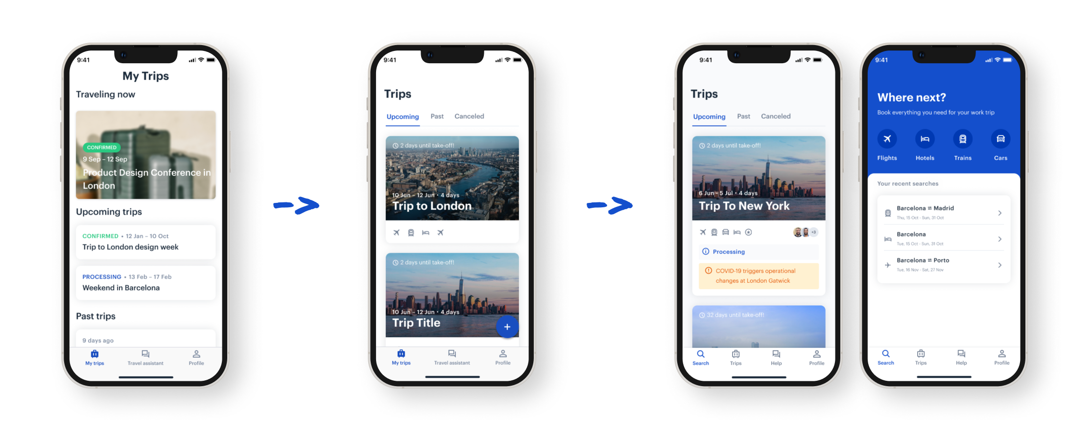
There is a lot of work still to be done, but even today we are already beginning to see the fruits of our labor. Not only is there greater consistency in the work that is being produced, but it takes us significantly less time to assemble high-fidelity screens using our component library.
The visual language across features and platforms has become more coherent, and we are able to use the time that we save to focus on raising standards of accessibility and looking more closely at user flows and micro-interactions among other things.
We estimate that over 90% of the app is built using components from the design system, while the remainder is native components that have not met the criteria for being added. The system has proven its power.
The next steps are to have a v1 of the component documentation which will live in a microsite, continue driving adoption, help engineering get to the same readiness state as design, and keep tending to different needs from the product design teams.
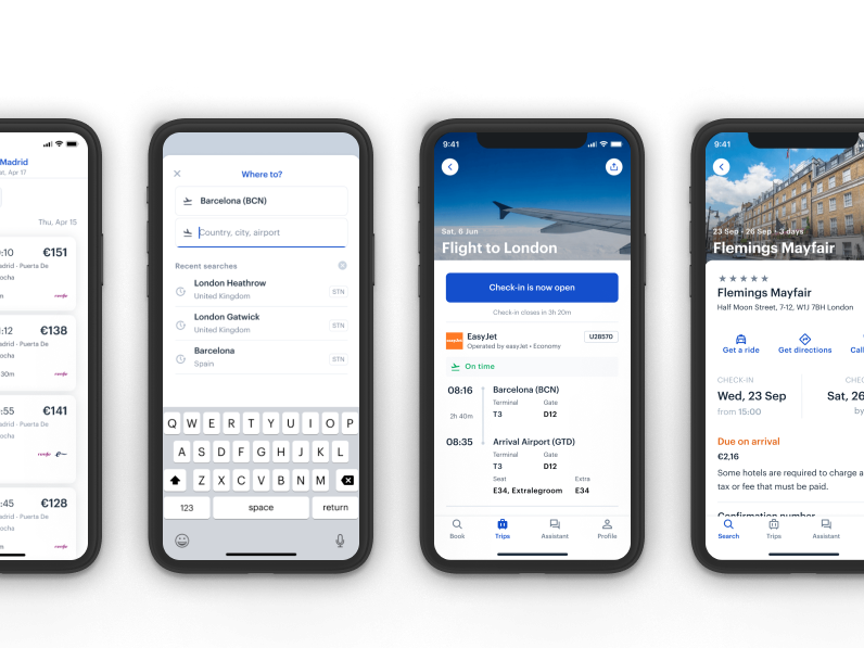
Our app runs on iOS and Android, and we want to be good platform citizens. Therefore, it should look like it belongs on the user’s device. While the lines between web and native apps continue to blur, they both have benefits and trade-offs. The users expect a different experience from native apps, a more seamlessly integrate with their device.
By thinking carefully about each platform, we create a design system that feels just right for iOS and Android that brings alongside the TravelPerk feeling and aesthetics.
Design conventions differ from platform to platform.Native apps aren’t the web, and we found it essential to consider this from the beginning of the app.
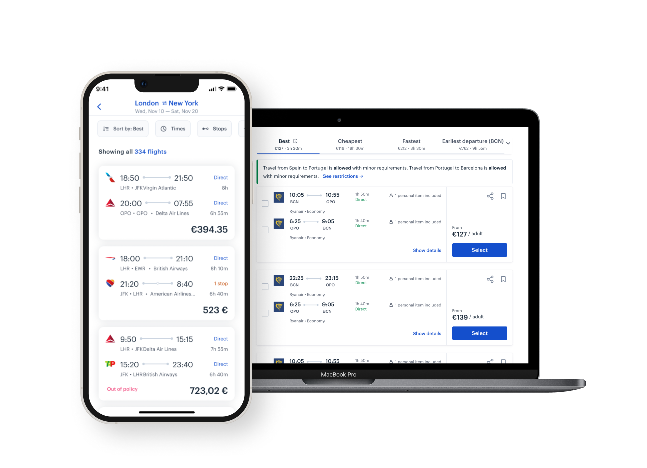
The web is an amazing medium, but it is not the only way our customers interact with our products
These differences in convention can affect the user’s ability to understand the UI or complete certain tasks.
Having an open design system is critical for a fast-growing company like ours. Moreover, building such a thing will bring various benefits like faster time-to-market, better internal communication, alignment between contributors, and consistency across our iOS and Android.
Our app runs on iOS and Android, and we want to be good platform citizens. Therefore, it should look like it belongs on the user’s device. While the lines between web and native apps continue to blur, they both have benefits and trade-offs. The users expect a different experience from native apps, a more seamlessly integrate with their device. By thinking carefully about each platform, we create a design system that feels just right for iOS and Android that brings alongside the TravelPerk feeling and aesthetics.
Designing a product for multiple platforms poses a variety of nuanced challenges. iOS, Android, and Web, contain their own unique guidelines, users, and devices.
The design should be subtly adapted to follow the conventions of each platform. We need to know the different types of UI that can be accomplished on each platform, the APIs that support it, and how they could affect performance.
From the start, I firmly believed that the key to our design system’s is the unification of UX/UI across both platforms allowing the system to be easily maintained on the design and development sides as we wish to have a more branded and coherent experience, not two different apps as we have users that use both OS.
Such an approach required a fair amount of convincing because most people are loyal to their platform of choice.
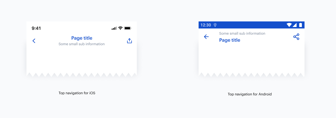
Although most components would become unified, some were deliberately left as “native” to keep the familiarity associated with each platform. Here is an example of our custom top navigation that conforms to native guidelines but uses the TravelPerk brand.
Some other components evolved into “hybrid” versions that mixed custom elements with platform-specific ones.
By thinking carefully about each platform we target, we can create a design system that feels just right for iOS and Android.
Comments are closed.