
Design system
Building travel experiences at scale
2019 – ongoing
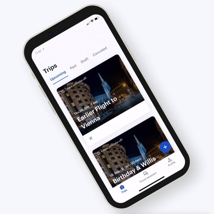
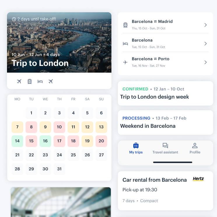
For the last two years, I’ve been leading the design of the TravelPerk mobile app. With it, we have been exploring different visual directions of the app, coming up with new usability patterns while delivering features.
We estimate that over 90% of the app is built using components from the design system, while the remainder is native components that have not met the criteria for being added. The system has proven its power.
An ongoing evolution
The mobile design team at TravelPerk is still tiny and growing daily. There are around twenty people who contribute to our designs in some way. Whether they’re commenting on our latest iterations, fixing copy, or designing cross-platform features.
We’ve already been able to rely on our ongoing UiKit for some time now, but we’re still revising and modifying as we go. We expect this will always be the case as we encounter new reasons to add components to our library or modify what exists, but it reached a point where it was essential to define a shared system that would avoid fragmentation and make us more efficient.


Our app runs on iOS and Android, and we want to be good platform citizens. Therefore, it should look like it belongs on the user’s device. While the lines between web and native apps continue to blur, they both have benefits and trade-offs. The users expect a different experience from native apps, a more seamlessly integrate with their device. By thinking carefully about each platform, we create a design system that feels just right for iOS and Android that brings alongside the TravelPerk feeling and aesthetics.
Native apps aren’t the web, and we found it essential to consider this from the beginning of the app.
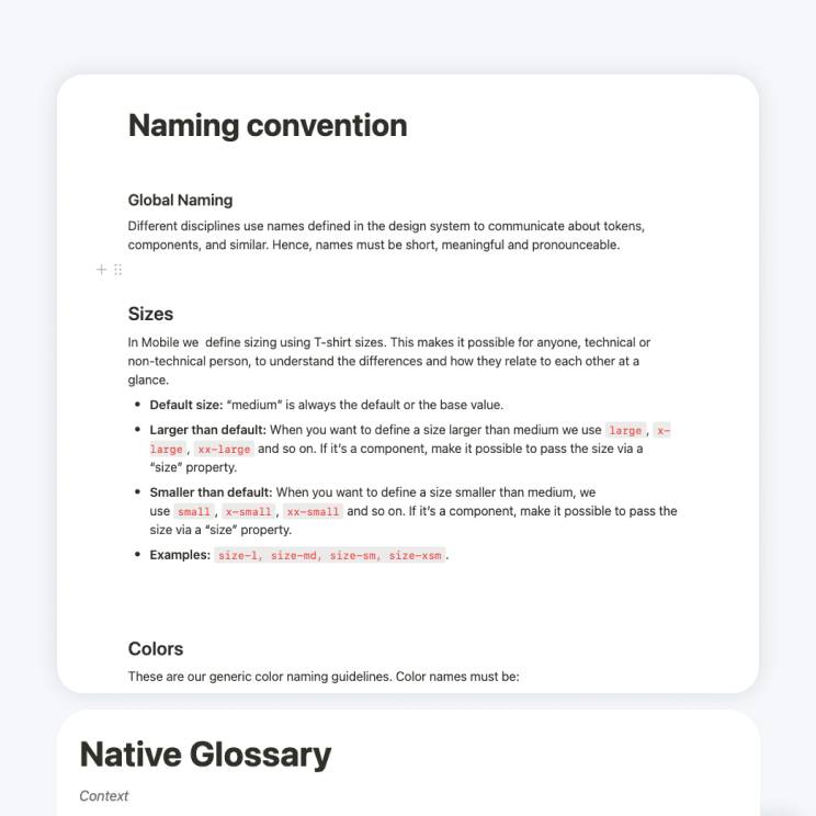
Establishing a vocabulary
I didn’t want to make any presumptions about how components should be organized, given that looking up something is part of the workflow around adoption. There was also the problem of referring to the same component in ten different ways, even so in Android and iOS.
Is it a modal? An overlay? A takeover? We needed to speak the same language between platforms, we need name parity.
I wanted to name components in a unique but recognizable and semantic way.
System foundations
At the heart of our system are a set of foundational elements and values which form the basis of all the other parts of the system. These foundations consist of a typography and spacing scale that’s based on a multiplier of 4, and a color library that contains a range of swatches.
Also theme options and guidelines from iOS to Android OS.
Perhaps, one of the most challenging things besides actually building this kit, was doing so in the middle of a transition between web and native apps. Consolidating both existing and incoming styling proposals.


Components
Working with our design foundations, we built a large set of grouped elements frequently used to solve UX problems within the interface. We call these groups components, and we arrange them together in the order of the function they serve.
These components can then be re-used by designers and developers on the team to help keep our workflow fast and consistent by avoiding the redesign and build of solutions we’ve already solved for.
At the same time trying to bridge the gap between iOS and Android guidelines.
The component pages in this kit are organized into quickly scannable sticker sheets with documentation and how to use it.


The multi-platforms
From the start, I firmly believed that the key to our design system’s is the unification of UX/UI across both platforms allowing the system to be easily maintained on the design and development sides.
Designing a product for multiple platforms poses a variety of nuanced challenges. iOS, Android, and Web, contain their own unique guidelines, users, and devices.
The design should be subtly adapted to follow the conventions of each platform. We need to know the different types of UI that can be accomplished on each platform, the APIs that support it, and how they could affect performance.


As we wish to have a more branded and coherent experience, not two different apps as we have users that use both OS. Such an approach required a fair amount of convincing because most people are loyal to their platform of choice.
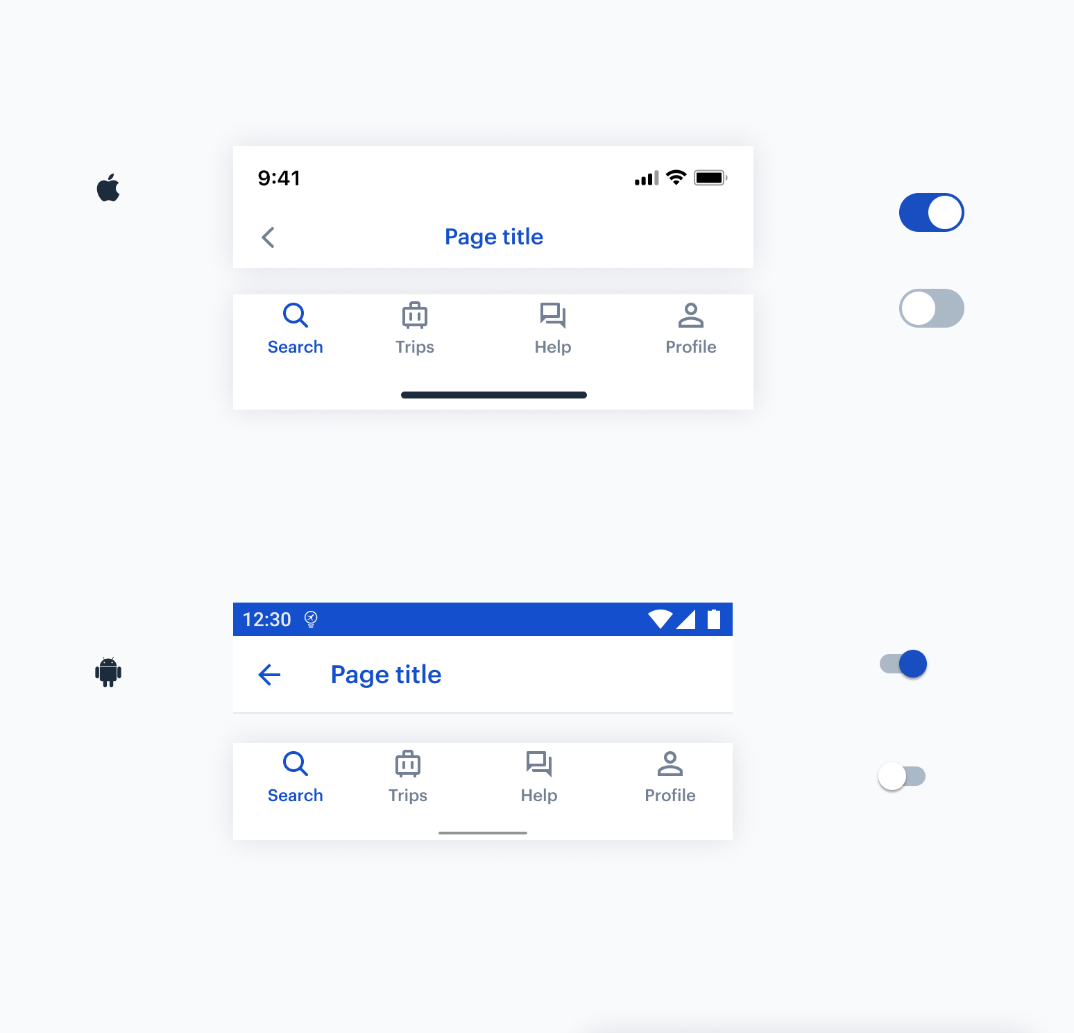
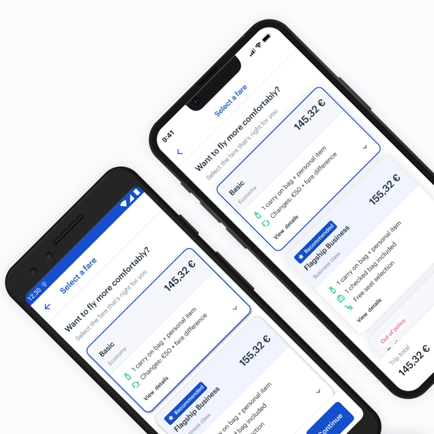
Although most components would become unified, some were deliberately left as “native” to keep the familiarity associated with each platform. Here is an example of our custom top navigation that conforms to native guidelines but uses the TravelPerk brand.
By thinking carefully about each platform we target, we create a design system that feels just right for iOS and Android.
Libraries
We approach our design system as though we’re building a product for our own team to work with. We chose to arranged our components into a series of seperate library files within Figma, because this makes it easier for designers to search for and find each component more easily within it’s relelvent library. It also helps to ensure the libraries maintain a sensible file size that can be easily maintained.
Therefore, we needed to give our developers (and us) a better overview and structure of all the reusable components. We want to keep everything clean, well organized, and easily accessible to designers and engineers.


One library serves one goal. This means we prefer having multiple libraries to a monster one containing everything.
Because this makes it easier for designers to search for and find each component more easily within it’s relelvent library. It also helps to ensure the libraries maintain a sensible file size that can be easily maintained.
The mobile core is our primary source of truth. It contains all the atomic components like buttons, inputs, text fields, top bars, native elements, etc. We rarely do edits on them since they have been solved already, and there is no need to reinvent the wheel.
Our mobile app has different domains with their own needs. For example, flights, Cars, Trains, and Hotel these verticals have their specific components, and these are the subject of iteration the most. This is a place to keep design elements tailored to particular products or audiences.
Documentation
While defining the system it’s been essential to create and maintain a set of documentation libraries.
The documentation process has been beneficial for new joiners to the native team, helping them get up to speed quickly and learn how the sustem is used.
We also use the documentation to help articulate our agreed outcomes and decisions from weekly Mobile Design meetings to ensure everyone is on the same page about how we intend to approach certain solutions and work with our assets in a consistent way.
Guidelines are detailed illustrated instructions for any contributor. These describe when to use which component, how to use it in a layout, how to animate it, what padding should be, and many other technical details.

Process
We keep it under frequently review to ensure it can adapt and change to include the latest approaches we’ve taken, and keep up to date.
We keep an agenda building throughout the week as we discover items we need to cover and discuss. Then on Mobile Design meeting we come together and cover off all the aspects of the system that need to either change, be added, consolidated, removed, discussed or documented.


Looking back, we have made a significant amount of progress with our design system efforts in the past year. The way we’ve structured things has worked for us so far, but it’s already evolving.
There is a lot of work still to be done, but even today we are already beginning to see the fruits of our labor. Not only is there greater consistency in the work that is being produced by the team, but it takes us significantly less time to assemble high-fidelity screens using our component library.
The visual language across features and platforms has become more coherent, and we are able to use the time that we save to focus on raising standards of accessibility and looking more closely at user flows and micro-interactions among other things.