
Farfetch
2012 - 2016
This project gave me the chance to innovate the visual language and apply a lot of critical thinking in the process. We had to develop new creative solutions and use different specialists.
My role
create and design assets/visual content for the Farfetch website and mobile apps
Provide direction for the team and clearly define brand guidelines
Pro-actively push the level of quality in both thinking and execution
create and design assets/visual content for the Farfetch website and mobile apps
Design online content including homepages and website features
Support the product team to improve the website and design new features
Work cohesively with other departments (i.e., marketing, editorial, product) to execute projects; keeping to deadlines
Platforms
Web
Skills
Interaction designer
Visual designer
Prototype
Design system
UX Interviews and testing
Run workshops
The teams
Lead Designer: Marco Lopes (in house at Farfetch)
Head of UX & Design: Tara Fowler
Development: Farfetch
The project
I’m really proud of is the opportunity I had to redesign Farfetch’s website with an amazing team of designers / UX and developers. This project gave me the chance to innovate the visual language and apply a lot of critical thinking in the process. We had to develop new creative solutions and use different specialists. At the end we established a design pattern and a visual language that is now being used by all other platforms. It was a long and fascinating process, from which I learnt a lot.
While best practices are important, they can also be a bit lackluster and many of the eCommerce experiences we reviewed were very clean and elegantly designed, but lacked any sort of immersive experience.
This presented an opportunity. One that brought innovation to the product browsing experience through thoughtful interaction and consideration of eCommerce best practices. Countless explorations were required, multiple challenges faced, but focusing our energy on an elevated user experience provided a new interface that could be used throughout the site.
Through a very collaborative effort, i helped the Farfetch to get a fresh new redesign and relaunch its web platform with an emphasis on e-commerce and a hybrid blend of user experience and visual design.
Change the color to match your brand or vision, add your logo, choose the perfect layout, modify menu settings and more.

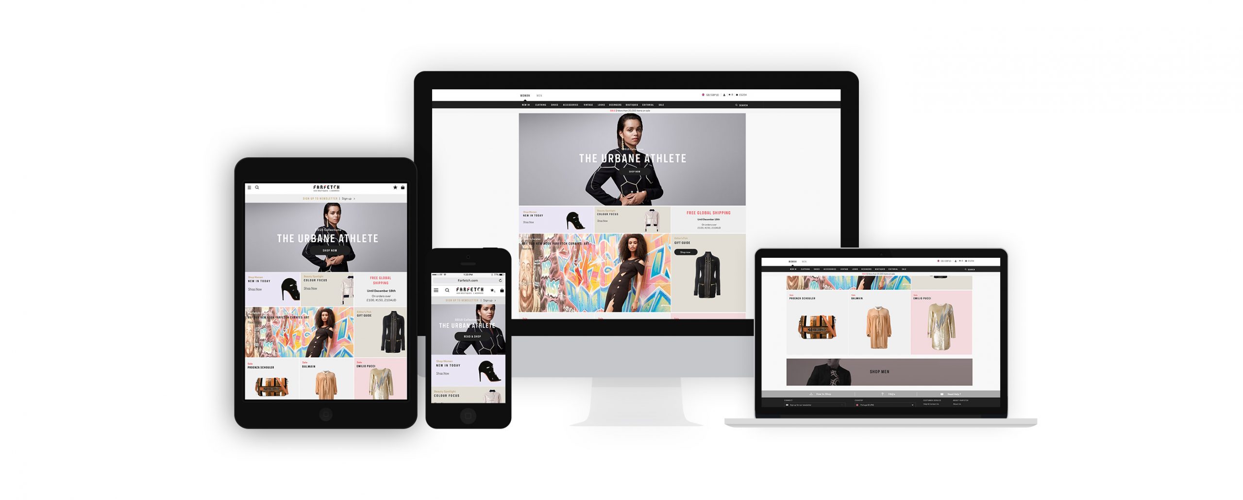
Was a 6 month way through all the options, many UI kits, many pages. As before we didn’t have a responsive website site, so we all toke this big changeling to make this new website responsive, following our time schedules that were very tight.
As me the main designer there i toke the challenge to build a brand new visuals, from typography to grids. Like all of our projects, our goal from the start was to align with the brand foundations identify opportunities we could leverage to better express their positioning.
Our UI framework — it’s not a definitive guide on how a web shop should be built. It’s tailored specifically to our needs. Many of the ideas in our library are a greatest hits collection of ideas others have pioneered that we’ve adapted to a new situation. it’s a learning library.
The Research
A really important step in our process is to do Visual insights. This is a great workflow because it means we can build the component as per the design to build the UI in the most appropriate way.
I wanted to really understand the design/brand. The first thing I did was sit down and go through all the designs they had before and understand the concept.
We printed and annotated the designs, creating a common language between design and tech. This would help us communicate better and establish consistency through our components.
By working closely with everyone I was able to define the UI structure, especially for the homepage.
Collaborating with marketing, stakeholders is such an important step!
I ❤ collaboration.

Creating an Atomic UI kit
Building up from Molecules to Organisms encourages creating standalone, portable and reusable components.
We’ve created a living Brand Library, a website explaining our brand, our characteristics and our beliefs. In the Library we also feature something we call a UI kit, a repository for our Atomic Design elements in Sketch. We like to think of them as identical twins living separate lives.
By limiting our UI kit to Atoms and Molecules i give the design team the freedom to explore and create their own Organisms.
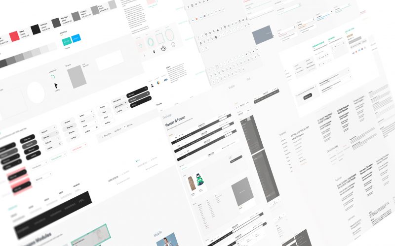
Establishing Design Language System (DLS)
Farfetch has experienced a lot of growth over the years. Currently our design department consists of nearly a dozen functions and outcome teams. It became clear that we needed more systematic ways to guide and leverage our collective efforts. While we recognized these challenges within the company, I believe they are symptoms of larger software industry problems.
So i start to gather all the old elements and refine them to a new luxury-driven design, but not lose the farfetch identity, instead of relying on individual atoms, i started considering our components as elements of a living organism. They have a function and personality, are defined by a set of properties, can co-exists with others and can evolve independently.
Compiling the library - Design Language System (DLS)
A master file called library, which we referred to throughout the design process.
While the library was growing, we started organizing individual components into artboards containing similar items. These artboards were then organized by general category into: Navigation, Content, Image and Speciality.
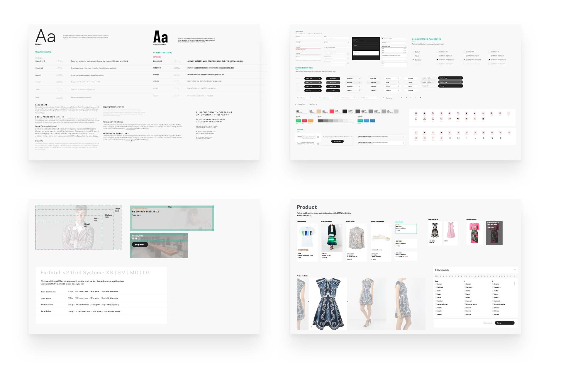
There was a strong focus in developing the design direction, first. Setting a design language that adopted Farfetch timeless qualities but translated well on the web, through any interactive touch-point.
During this process, various options were explored that showcased and sampled an online presence.
The outcome was a new digital design language, focused on great typography and minimalist design, where products and photography became the site’s centerpiece.
The design
The idea of seamless integration is one we didn’t take lightly. I wanted to make sure that anywhere on the site, users can engage in content pushes the products, positioning, and personality of the brand. We knew that if we could do this well, we would could improve metrics across the board and more specifically—time on site, return visits and engagement.
The new site is designed in a way that allows the personality of the brand to come through. Refined, and beautiful and so is the design system of the new eCommerce experience. From its minimal elegance to bold typography and images, the design system is solely focused on highlighting the lifestyle of the brand.
Interactions and animations bring the site to life in a way that is delightful and easy to use, similar to how the products are designed to be functional as well as beautiful.
Homepage
The home page (as well as the entire experience) is built using various components and layout modules that can be mixed and matched to tell seasonal stories, push new products, and highlight editorial content.

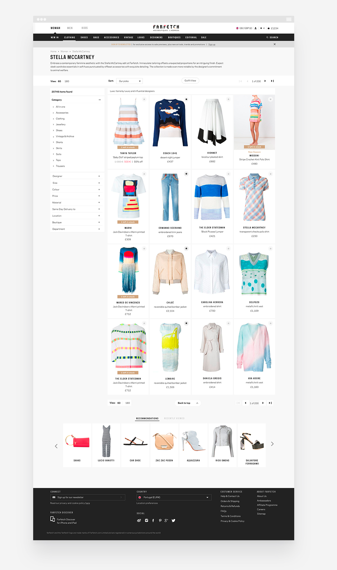
Telling Stories and Providing Context on the Product Listing and Product Detail Pages
When it comes to articulating a brand’s personality and story, things typically fall apart on the product listing and product detail pages. Because providing an “experience” is crucial, design the PLP and PDP pages in a manner that continues to provide context and inspiration through things like videos, popular trends, collection call-outs, and engaging imagery.
While best practices are important.
One that brought innovation to the product browsing experience through thoughtful interaction and consideration of eCommerce best practices. Countless explorations were required, multiple challenges faced, but focusing our energy on an elevated user experience provided a new interface that could be used throughout the site.
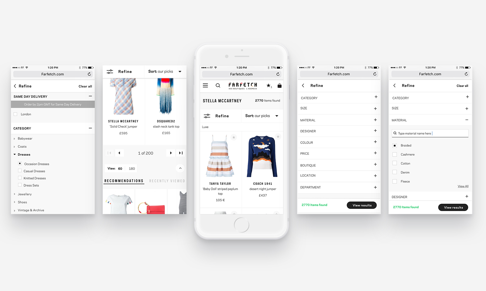
Mobile
Moving from desktop down to mobile was a fairly easy transition. At this size, the product tiles stacked and occupied the entire screen width so we were able to surface the alternate finishes without fear of a cluttered layout. This experience is meant to focus more on the details of a few products versus browsing an entire catalog.
Product detail page
We designed the product page in a non-traditional manner.
Inspiration from fashion magazines and editorial layouts to craft a system for creating product page that tells each one’s unique product.

Mobile

Other Pages
